The web design process is the staged design-craft sequence that turns a brief into a launch-ready design — the ordered run of work a designer moves through, from the first conversation about what a site is for to the finished, signed-off design that a developer can build. It is not the act of writing code, and it is not the back-and-forth of contracts and invoices that surrounds a project. It is the making of the design itself, taken one phase at a time. As a creative director, I think of it less as a single leap from idea to website and more as a route with marked stops, each one producing something the next depends on.
Two things sit inside that sentence, and they are worth separating, because owners tend to ask about them together and then judge the result against the wrong one. There are the ordered phases — the discrete passes the work goes through before anyone calls it done. And there is the launch-ready design those phases produce: a complete, agreed design of the site, styled and navigable, ready to hand over. The phases are the method; the launch-ready design is the deliverable they exist to create. Confuse the two and the whole thing reads as guesswork, which is exactly how a website ends up redesigned twice before it earns its keep.
This is written for the owner about to commission a website who wants to know how the work actually proceeds before signing off on it — and it is written from the designer's chair, where each phase has a reason it sits where it does. Knowing the shape of the design process is what lets an owner brief well, react at the right moments, and recognize a launch-ready design when one arrives rather than approving something half-formed. So the place to start is the route itself: what the staged sequence is, end to end, before any single phase gets walked.
The Web Design Process Step by Step
The web design process, taken step by step, comprises an ordered sequence of design phases that moves from a project brief to a launch-ready design — each phase a distinct pass of work, each one feeding the next. Step by step is the honest way to describe it, because the phases do not happen at once and they do not reshuffle freely; the order carries meaning. A designer cannot lay out a page before knowing what the page is for, and cannot style a screen before its structure is settled. The sequence is the method, and the method is what produces a design worth building.
Mapped end to end, the web design workflow runs through a recognizable set of stages. It opens with a project brief and discovery, where the goal, the constraints, and the audience get named. It moves into research, where the people the site is meant to serve are understood well enough to design for them rather than at them. From there it takes shape structurally — first as a sitemap that fixes what pages exist and how they relate, then as a wireframe that settles the bare structure of a page before any styling lands on it. Visual design follows, giving the structure its character: color, type, imagery, and the interface a visitor will actually touch. Then comes review, where the design is iterated and tested against real conditions until it holds. And it closes at handoff, the seam where the finished design stops being a design and becomes a build job. Each of those is a phase in its own right, walked in turn rather than all at once.
This staged sequence sits inside the larger discipline of web design — the visual, experience, and interface craft of a website — as the how underneath the what. Web design names the layers that make a site work; the process is the route by which those layers get decided, in order, for one specific site. The discipline answers what good design consists of. The sequence answers how a design gets made, phase by phase, until it is ready. With the route mapped, the first phase is where the real work starts — and it starts, as every design does, with a brief and the discovery around it.
The Project Brief and Discovery
The project brief and discovery is the front-of-process inputs phase of the web design process — the stage where the brief and goals get gathered before a single page is designed. This is phase one, and it earns that position for a plain reason: every later decision answers back to what the brief defines here. Skip it, or rush it, and the rest of the process designs in the dark. So the web design process starts from the brief and discovery, which is to say it starts from understanding before it starts from making.
What this phase produces is not a layout or a wireframe. It produces the design inputs — the goals, the requirements, and the constraints that frame how to design a website that does what the business needs. Two distinct things happen inside it. One captures the goals: what the site has to achieve, who it serves, what it must hold. The other fixes the boundary: which pages and templates the design will actually cover. The first is discovery. The second is the project scope. They sit together because they answer different halves of the same question — what the design is for, and how far it reaches.
A point worth drawing clearly, because the term gets stretched: the phase being described here is the design-craft process, not the engagement around it. There is a separate, parallel process that runs the client relationship — the proposals, the scoping conversations, the agreement that frames the work commercially — and that whole client-side "web design process" is its own subject with its own walkthrough. The two share the same name, which is exactly why the distinction matters. The brief and discovery as a design input gathers what the design must answer to; the engagement side handles how the project gets agreed and run. Holding that line keeps this focused on how the design itself gets made.
Once the goals are captured and the boundary is set, the brief stops being a conversation and becomes an instruction the design can be measured against. Those goals then feed the next phase. What a designer learns about the business in discovery becomes the question the research goes out to answer about the people the business is trying to reach.
Discovery
Discovery is the goal- and input-gathering work inside the project brief — the part of phase one that collects what a design has to know before it can begin. It names the things that frame every design decision downstream: what the site must achieve, who it is for, and what content it has to carry. Where the brief as a whole sets the terms, discovery is how those terms get surfaced and written down.
Three inputs do most of the framing. The goal comes first — an online store, a lead-generating presence, a portfolio, a booking flow each pull the design in a different direction. Then the audience: a rough sense of who arrives and what they came to do, enough to point the later research without pretending to be it. Then the content: the pages, the messages, the assets the site must actually hold, because a design with nowhere to put the real material is a design that breaks on contact. Gather those well and the design has a foundation that holds; gather them loosely and every later choice inherits the gap. With the goals captured, what remains is to fix how far the design reaches — the project scope.
Project Scope
Project scope is the boundary of what the design covers — the line that says which pages and templates this phase of work will produce, and which it will not. Where discovery captures the goals, scope sets the edges around them. It is the difference between a brief that names an ambition and a brief a designer can actually act on, because an ambition without a boundary expands until nothing inside it gets finished well.
What the scope bounds is concrete: the page set and the template set the design will deliver. A handful of unique page designs and a few repeatable templates is one scope; a sprawling site with dozens of distinct layouts is another, and the design effort differs accordingly. Fixing that boundary early keeps the work honest — it names the deliverables the design phase owns, so the visual and structural phases that follow know exactly what they are styling and composing. This is strictly the design boundary, the shape of the design itself. With the goals captured and the boundary fixed, the brief has done its job, and the process turns to the people the design is meant to serve.
Audience Research
Audience research is the phase that follows the brief — the research step where a designer gathers the audience insight the design decisions depend on. The brief named who the site is roughly for; research goes out and learns it properly. This is phase two of the web design process, and it sits where it does for a reason: a design made for an assumed audience is a guess, and a design made for a studied one is a decision. To design a website that connects, a designer has to know who arrives and what they need before settling how the site should look or move.
The work studies the people the site serves and produces an input the later phases build on. It takes the brief's goals — the audience the discovery work sketched, the outcomes the business wants — and turns them into something sharper: who the visitors actually are, what they are trying to do when they land, what slows them down, what they expect a site like this to feel like. That insight is the product of the phase. It is not styling and it is not structure; it is the understanding that tells the structure where to lead and the visuals what to signal. For the businesses we design for across Alaska, that means learning an audience that arrives with specific needs and specific patience, and designing to those rather than to a generic visitor who does not exist.
Research stays a clean, distinct phase by design. Folding it into the brief, the way much of the field does, lets real audience understanding get skipped under the cover of having "talked about the audience." Held on its own, it produces an input the structural phases can lean on. What research learns about how people move toward what they want becomes the raw material for the next decision — how the pages get ordered and each screen gets framed, which is where the sitemap and the wireframe take over.
The Sitemap and Wireframe
The sitemap and wireframe are the two structural-design artifacts the web design process produces after the research is in and before any visual styling begins. They are where a site stops being a set of findings about an audience and becomes a shape — an ordered set of pages, and a plan for what each page holds. In the web design process, the sitemap and wireframe phase is the moment a designer commits to structure: the sitemap maps which pages exist and how they rank against one another, and the wireframe sketches what goes where on each of those pages before a single color or typeface is chosen.
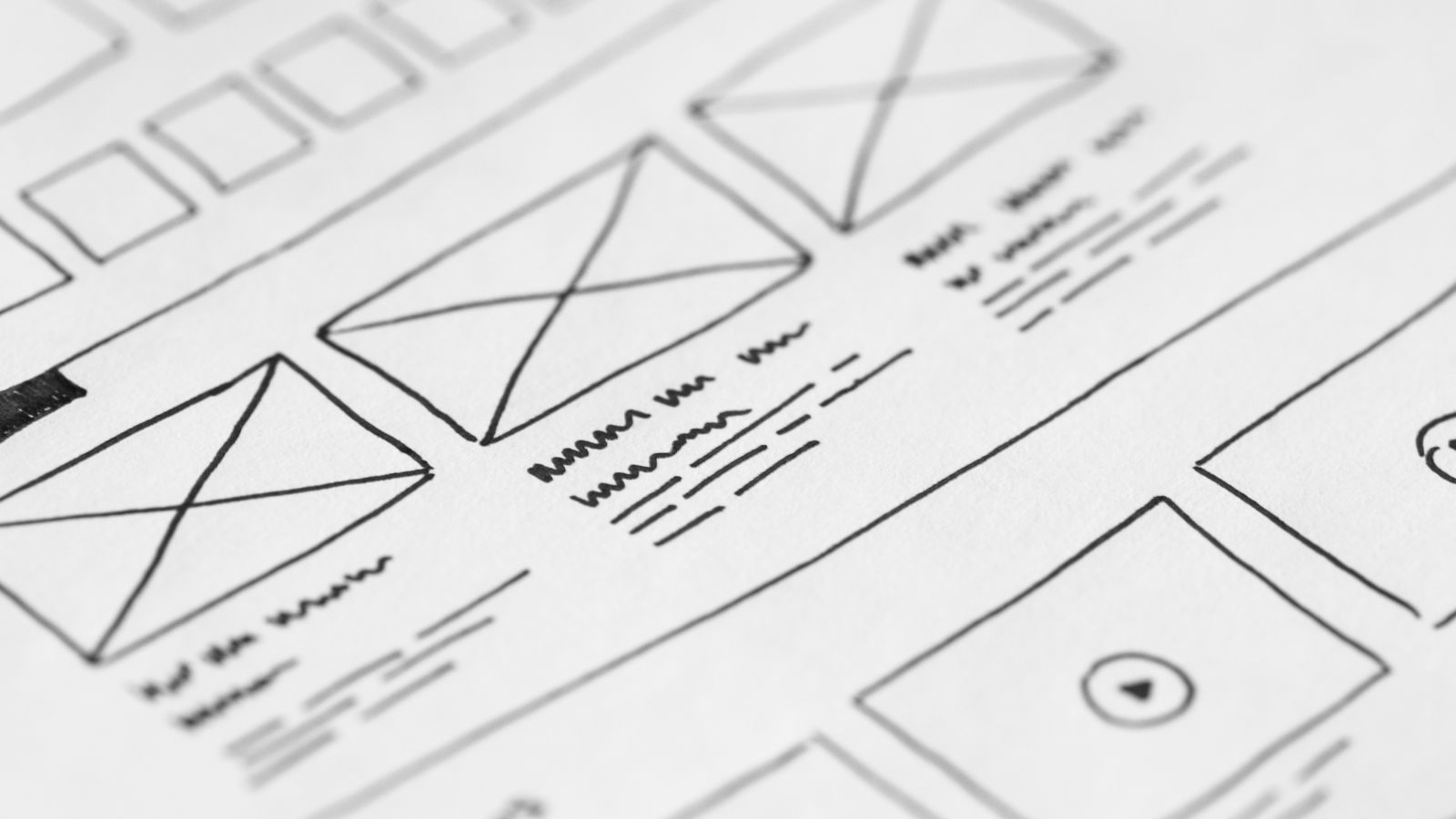
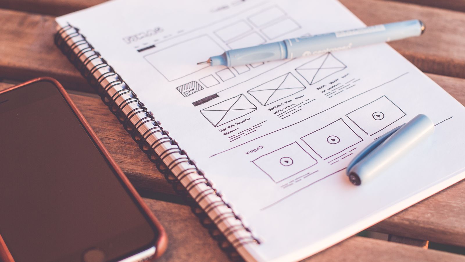
Order comes first. The sitemap structures the site at the level of the whole — it takes the research insight about what visitors are looking for and turns it into the pages the site will hold, ranked by importance. Once the page set is settled, the wireframe drops down a level and works inside a single page. A wireframe is the bare composition of a page — blocks for the header, the content, the calls to action, the navigation — drawn in grey before any visual styling lands on it. It answers where things sit and how big they are, not what they look like. That separation is deliberate: the wireframe fixes the page's composition before any visual styling arrives, so that layout decisions get made on their own merits rather than getting tangled up with color and type.
This is also the stage where a static page sketch grows into something a client can click through — a prototype that links the wireframed pages together and shows how a visitor would move between them. The craft of turning grey blocks into a faithful, testable model has its own depth, and the fidelity ladder, the tooling, and the techniques behind it belong to "wireframing and prototyping" rather than to a walk through the process as a whole. Named here, it sits exactly where it belongs: the artifact the structural phase produces and hands forward.
What the structure phase produces, then, is a page set and a per-page composition — the bare structure the styling work styles. The wireframe sets each page's composition before any visual styling; the next phase takes that composition and gives it a surface.
Sitemap
The sitemap is the ordered set of pages a site will hold — the page-inventory artifact of the structural phase, drawn up before the wireframe goes near any single page. It names every page the site needs and ranks them, so the home page, the core service pages, and the supporting pages each sit where their importance puts them. A sitemap is not the navigation menu and not a list of web addresses; it is the inventory of pages and the order among them, settled before composition begins.
What the sitemap orders is the page set the wireframes then compose. Each page on the sitemap becomes a page that gets wireframed — the sitemap decides which pages exist and how they relate, and the wireframe decides what each one contains. Designing a web page only makes sense once the sitemap has placed that page in the whole: a page designed in isolation, with no sense of what sits above or beside it, tends to fight the rest of the site rather than fit it. So the sitemap precedes the wireframe by necessity, not by habit. The inventory comes first, and the per-page composition follows from it.
Visual Design
Visual design is the styling phase of the web design process — the phase that applies color, typography, and imagery to the wireframe and turns a grey structural plan into a styled visual surface. Within the web design process, visual design is the phase that takes the settled composition and decides how it looks: which palette carries the brand, which typefaces set the voice, which images do the work. Where the structural phase fixes where things go, visual design decides how those things read on the eye.
The styling phase makes its decisions on top of the wireframe, never around it. A header block stays a header block — visual design gives it a color, a type treatment, a photograph or an illustration, and a sense of weight against everything else on the page. Good styling at this stage holds to a quality bar that separates a polished design from a busy one: clear hierarchy so the eye knows where to land first, balance across the page so nothing tips, contrast that makes the important elements read, and whitespace that keeps the layout open and uncrowded. Those are the standards that govern the choices, and the full rules behind them — why hierarchy works, how much contrast is enough, what balance actually means in practice — sit with the web design principles rather than inside a single phase of the process. Held to that bar, the styling work carries the design; ignored, it produces a page that looks decorated rather than designed. For the businesses we design for across Alaska, that bar is the difference between a site that merely renders and one that reads as the work of a serious company.
Visual design breaks into two pieces of work the styling phase carries out in turn: the concrete styling decisions a designer settles, and the styled comp those decisions assemble into. The first is where color, typography, and imagery get chosen for this particular site. The second is where they come together as a single representation of the finished design — the artifact the review loop then signs off. Both run on top of the same wireframe, and both produce the styled design the next phase puts in front of decision-makers.
Visual Elements
The visual elements are the concrete decisions the styling phase settles — color, typography, and imagery, the three choices that give a wireframe its surface. These are what visual design decides for one particular site: the palette that carries the mood and the brand, the typefaces that set how the page reads and sounds, and the imagery that fills the picture-shaped spaces the wireframe left waiting. Named together, the visual elements are the working parts of the styling phase, applied to the structure the wireframe fixed.
Each of the three does a distinct job on the page. Color sets tone and signals the kind of business behind the site before a word is read. Typography governs how comfortable the page is to read and what voice it speaks in. Imagery carries meaning the words cannot and grounds the design in the real. The deeper craft of each — how a palette gets built, how typefaces get paired, how imagery gets chosen and treated — is its own subject; at the level of the process, what matters is that visual design decides all three for the site, and decides them as a set rather than one at a time. Settled, those decisions feed into the artifact that assembles them into one styled view.
Mockup
The mockup is the styled comp that represents the finished visual design before sign-off — the deliverable the styling phase produces once the visual elements are settled. A mockup takes the wireframe's composition and the chosen color, typography, and imagery and presents them as a full-fidelity picture of how the site will look: a static, pixel-accurate representation of a page or a set of pages, fully styled and ready to be judged. It is what visual design hands forward.
A mockup is not a wireframe, and the two are worth telling apart at this stage. The wireframe is structure — grey blocks settling where things go, the work of the phase before this one. The mockup is surface — the same blocks fully styled, showing exactly how the design reads. One fixes composition; the other shows the finished surface. A mockup also differs from the working site: it presents the design, but nothing in it functions yet. That is by design at this point in the process, because the mockup exists to be reviewed, not used. As the styled comp that stands in for the finished visual design, the mockup is precisely what goes into review — the representation decision-makers look at when they decide whether the design is ready to move forward.
Review and the Launch-Ready Design
Review is the phase of the web design process that turns a styled mockup into a launch-ready design — the sign-off loop where the design gets checked, revised, and finally approved. In the web design process, review is the phase that follows visual design: it takes the finished mockup, holds it up against what the project set out to do, and works it until everyone agrees the design is done. The styled comp arrives looking finished. Review is what proves it actually is.
Few teams treat this as a named phase, and that is a mistake. A design that goes from the visual stage straight to the build carries every unexamined assumption with it — a headline nobody questioned, a flow that reads well in a static frame but stumbles the moment a real person follows it. The review phase exists to catch those before they become expensive. We run the design back through the people who own the project and the standards it has to meet, and we keep running it until the mockup converges on a version everyone can sign off on. That signed-off version is the launch-ready design.
The phase carries two kinds of work, and they answer different questions. One asks whether the design is right — whether the feedback has been heard and folded back in, pass after pass, until the disagreements run out. The other asks whether the design holds up — whether it behaves the way it is meant to across the screens and states a real visitor will meet. The design is reviewed, iterated on, and validated, and only then does it become the launch-ready design the project hands off. What that signed-off design feeds into is the next concern entirely.
Iteration
Iteration is the revise-on-feedback loop inside the review phase — the cycle where the design is changed in response to what the review surfaces, pass after pass, until it converges on sign-off. Each round works the same way: the design goes out, feedback comes back, and the designer revises against it, then sends the revised version round again. Iteration is the part of review that refuses to call a first draft final. It assumes the design will be wrong in small ways the first time, and it builds the correcting-in into the process rather than hoping the mockup landed perfectly.
What makes a loop converge rather than spin is direction. Every pass should refine the design toward the version that gets approved, not reopen settled decisions or chase fresh ideas late. Early rounds tend to move large things — a layout that isn't carrying the message, a tone that reads wrong for the audience. Later rounds tighten: spacing, wording, the weight of a single call to action. The feedback narrows, the changes shrink, and at some point a pass comes back with nothing left to fix. That is the design converging on the signed-off version, and it is the signal that the loop has done its job.
Iteration is design revision, and it stays inside the design. It refines what the mockup looks like and how it reads, working the styled comp the visual phase produced into the approved one. Convergence is half the review phase. The other half checks that the design the loop is converging on actually behaves.
Testing
Testing is the design-side validation the review phase runs on a design before it is signed off — the checks that confirm the design holds up, not the checks a developer runs on a finished build. Testing here validates the design itself: that the responsive comps hold across the screen sizes the project cares about, and that the interaction states — the hover, the focus, the pressed button, the empty form, the error message — are designed and read correctly. The styled mockup gets pressed against the conditions a real visitor will create, while it is still a design and still cheap to change.
The line matters, because the word invites a different reading. This is design validation — confirming the design works as a design. It is not the website build and its quality assurance, which check whether the developed site runs, loads, and behaves in a browser. A design tests responsive comps; a build tests the running site. Drawing that boundary keeps the review phase on the design side and leaves the build's verification to the work that owns it. The responsive layouts are checked, the states are checked, and the design earns its sign-off on design terms.
Testing is what lets the review phase commit. Once the responsive comps hold and the states read correctly, the design has been validated as far as design can validate it, and the iteration loop has converged on a version everyone approves. The reviewed, revised, and validated design is signed off — and a signed-off design is no longer a work in progress. It is something the project is ready to hand to whoever turns it into a working site.
From Launch-Ready Design to the Website Build
The handoff is where the web design process ends and the launch-ready design becomes a build job — the seam between making the design and making the site. The web design process ends at the handoff: every phase up to this point has produced and refined a design, and the handoff is the moment that finished design stops being a design problem and starts being a development one. The launch-ready design is done. The website that gets built from it has not started.
That pivot is the whole point of naming the seam. Up to the handoff, the work is design — discovery, research, structure, visual craft, and the review loop that signed it all off. At the handoff, the launch-ready design changes hands and changes nature: it stops being something a designer shapes and becomes something a developer builds. The design does not get coded or turned into a running site inside the web design process — that belongs to the build, and the build is a separate body of work with its own phases. The web design process hands the launch-ready design off; it does not follow it into development.
Where the build begins is where the website development process takes over — the front-end coding, the content management setup, the testing of the running site, and the launch itself all live there, downstream of the design. Naming that seam is the responsible way to end a process article: the design work is finished at the launch-ready design, and pretending the same article can also teach the build would blur a boundary that is real on every project. The web design process produces a design. What turns that design into a live website is development territory.
Launch-Ready Design
The launch-ready design is the signed-off design package the handoff delivers — the finished, approved design a developer can build from. It is the endpoint deliverable of the web design process: the version that survived the review loop, passed its design-side checks, and earned sign-off, packaged as the thing the next stage works from. The launch-ready design is not a sketch or a direction. It is the resolved design, settled enough that building it is a matter of construction rather than further design decisions.
What the package represents is a design with its questions answered. The layouts are composed, the visual system is set, the responsive behavior is decided, and the interaction states are designed — the approved design a developer can build, with the design choices made rather than deferred. The launch-ready design represents the point where the design work stops carrying open decisions and starts carrying answers. The exact form the package takes — how the design and its assets get organized for the people who build from it — is a concern of the handoff itself, not of the design that the handoff delivers.
The launch-ready design is where the design process ends and the build begins. It is the last thing the web design process produces and the first thing the development work consumes. The design has been made; making the website from it is the next process, and a different one.